Activity 22: Research SMACSS - Scalable and Modular Architecture for CSS


What is SMACSS?:
SMACSS is a CSS architecture designed to help developers write scalable and modular CSS. It breaks down styles into manageable categories to make large projects easier to maintain.
Now, the architectural approach of SMACSS is a bit different from a CSS framework like Bootstrap or Foundation. Instead, it’s a set of rules, more like a template or guide.
Every SMACSS project structure uses five categories:
Base-In SMACSS, base styles define what an element should look like anywhere on the page. They are the defaults.
So it s`hould include default sizes, margins, colors, borders, and any other default values you plan to use across your website.

Layout- Layout styles will divide the page into major sections—not sections like navigation or maybe the accordion, for example, but really top-level divisions:
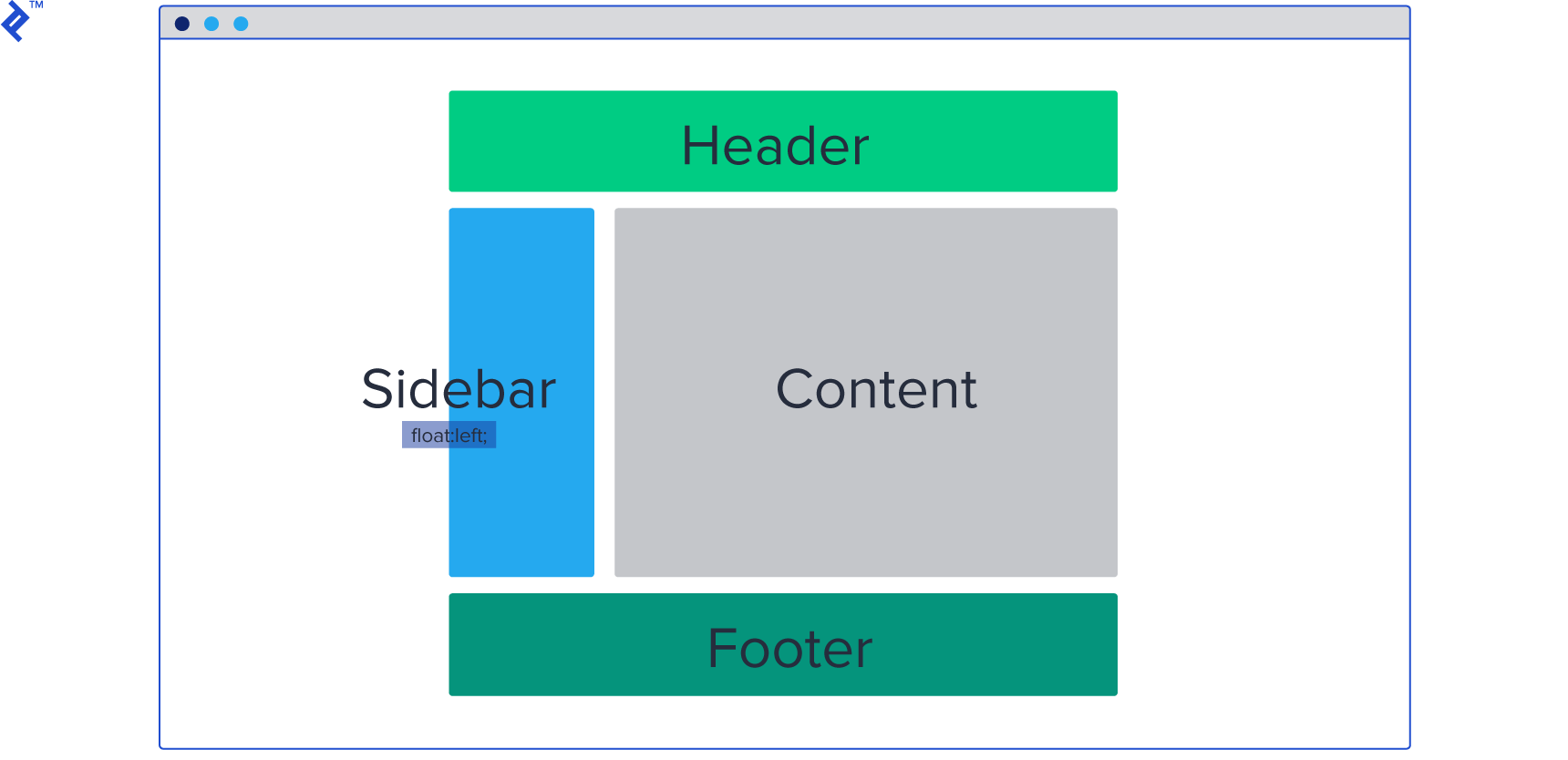
Modules- SMACSS modules are smaller bits of code that are reusable on the page, and they are part of a single layout. These are parts of CSS that we want to store in a separate folder, as we will have a lot of these on a single page.
State- States are applied to the same element as layout so we are adding an additional rule which will override previous ones, if any. The state rule is given precedence, as it’s the last one in the chain of rules.
 .box .element {
     display: none;
 }
!important may be used, as state is often used as a JavaScript modification and not at render time. For example, you have element that’s hidden on page load. On button click, you want to show it. But the default class is like this:
    .box .element {
        display: none;
    }
It will remain hidden even after you add the
.is-shownclass to the element via JavaScript. This is because the first rule is two levels deep and will override it..box .element { display: none !important; }5.Theme- This one should be the most obvious, as it’s used to contain the rules of the primary colors, shapes, borders, shadows, and such. Mostly these are elements which repeat across a whole website.
    .button-large {
        width: 60px;
        height: 60px;
       background-color: blue;
    border: 4px;
    }
    <button class="button-large">Like</button>
Advantages:
- Improves scalability, Modularity and maintenance of large projects, By following its principles, you can create a well-organized and optimized CSS codebase that is flexible enough to adapt to changing design requirements.
Practice:
Build a simple webpage using SMACSS principles.
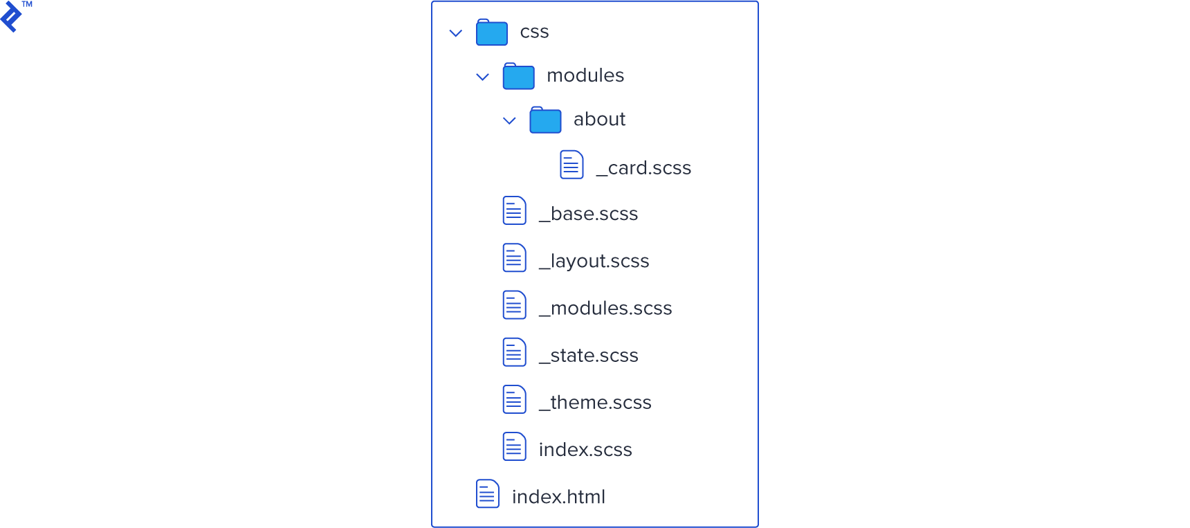
- In this practice I use a SMACSS principles. Layout, base, Module , theme and state.

CSS
/* Default theme */
body {
    background-color: #87e79c70;
}

/* Base styles */
body {
    font-family: Arial, sans-serif;
    margin: 0;
    padding: 0;
}

h1{
    font-weight: bold;
    margin-bottom: 10px;
}

p {
    margin-bottom: 20px;
}

/* Layout styles */
.l-header {
    background-color: #333;
    color: #fff;
    padding: 10px;
    text-align: center;
}

.l-main {
    display: flex;
    flex-direction: column;
    align-items: center;
    padding: 20px;
}


/* Navigation module */
.nav {
    list-style: none;
    margin: 0;
    padding: 0;
    display: flex;
    justify-content: space-between;
}

.nav li {
    margin-right: 20px;
}

.nav a {
    color: #fff;
    text-decoration: none;
}

.nav a:hover {
    color: #ccc;
}

.button-1{
    color: #000;
    padding: 20px;
font-size: 2rem;
font-weight: 600;
background-color: rgb(40, 204, 40);
}

.button-2{
    color: #000;
    padding: 20px;
font-size: 2rem;
font-weight: 600;
background-color: rgb(238, 149, 75);
}
.button-3{
    color: #000;
    padding: 20px;
font-size: 2rem;
font-weight: 600;
background-color: rgb(204, 40, 141);
}
For References: https://www.toptal.com/css/smacss-scalable-modular-architecture-css
GitHub repository: https://github.com/Koronuma4Dev/SMACSS